Task
Exxentric aimed to strengthen their brand through the implementation of a deliberate visual brand language in their product line. Rather than intuitively making design decisions for individual products, a standardized way of designing could create further recognition and provide benefits for further market growth.
Visual Brand Language
A company’s brand can be described as the gut feeling a person have regarding the company. When enough individuals have the same gut feeling of a company, the company have a brand. By extension, a brand is not defined by the company but by people viewing it. The company, however, can influence people’s perception of the brand through their communication and products.
A visual consistency, which is linked to a company’s brand values, is important in a product line as the physical products of a company acts as an extension of the brand itself. The visual brand language is used to create a resemblance between products and too differentiate within a market and often includes product’s shapes, materials, colour and composition.
The visual aspects of a brand language are based on the company vision and brand promise.
Thus, it is necessary to first define what the company vision and brand stands for. Therefore,
before creating the visual brand language, the brand needs to be defined to know what to
communicate. Vision, core values, market, identity and target audience are all important to
define as parts of the brand.

Approach
In order to create a visual brand language for Exxentric, a Design Platform was developed to be used as a tool when designing Exxentric’s physical products. It consisted of two parts, where the first part covered the brand and was aimed at communicating the overall feeling of what Exxentric is. It ensured that products communicate what Exxentric, as a company, stands for and acted as a reference to evaluate products against to see if they were in line with the brand.

Research
A market analysis of the form language and visual appearance of companies' products on the flywheel- and gym machine market was analysed in six different categories during interviews with users and people with no relation to the brands being analysed. The categories were: Material, Colour, Branding, Coherence, Aesthetics and Perceived overall impression.


During workshops with the Research and Development team at Exxentric as well as during workshops with external stakeholder, the company’s position on two different markets, the “Strength business” and the “Flywheel business”, was analysed in order to investigate the company’s unique selling points. The results from the workshops was thereafter analysed to gain insights that could be used to inform product design.

To further strengthen the understanding of how Exxentric’s brand was perceived, a two-piece
investigative survey enquiry was conducted. One was sent out in-house at the company and the other was sent to resellers of Exxentric. In-house, the survey enquiry focused on how employees would describe the company- and its products using three words, defining what the company was selling and to answer which two products they associated the most with the company. Resellers answered similar questions using three words to describe the company Exxentric and
its products respectively.

.jpg)
.jpg)
By analysing the customers in Exxentric’s three segments: Performance sports, Health & fitness and Rehabilitation, through discussions with Exxentric Management- and Sales and Marketing team, three different personas could be developed. These personas acted as a visual representation of who the users of Exxentric’s products are, and by extension, who to design for.

There existed several channels of communication between Exxentric and its customers through social media, the webpage, PR, marketing and sales regarding different benefits of the products. Yet no set guides existed within product development on what the physical products should communicate with regard to what benefits was communicated to the users and customers. By analysing and screening the communication within different customer segments and thereafter breaking it down into key words, the key words could be used to create five categories. These categories described the key benefits of Exxentric’s physical products being communicated outwards and outlines what products beneficially should communicate.

Furthermore, the results were used as a base for interviews, workshops and discussions with Exxentric’s management team for process of defining the brands outspoken vision and mission. Through an iterative writing- and evaluation process, it was possible to establish a company profile by asking four additional questions:
• Who are we?
• What do we do?
• How do we do it?
• Why does it matter?
By discussing these questions with Exxentric’s Management team, insights arose making it possible to establish a DNA for the company which could be used to translate values into design guidelines. In addition, a mission and vision statement for the company was created.
Creating Design Guidelines
Exxentric was considered one of the few companies in the flywheel business a genuine heritage during the positioning workshop, therefore it was important to allow for that heritage to be visible in the product design development. The kBox was the most prominent product of Exxentrics according to the survey enquiry. Therefore, some elements of the current kBox4 design was carried on into the design guidelines to create a consistency over time and a bridge between current- and future products. The cut-out shape of the kBox was chosen as a feature to change and to be carried on to new products whilst preserving the outer shape of the kBox for resemblance purposes. A variety of design options was developed and evaluated against what it was desirable for products to communicate.


The kBox was also used as a reference for exploring new colour options. Different variations were developed in Photoshop and Keyshot and evaluated based on what it communicated. The digital testing was followed by comparisons and evaluations of RAL colour-coded test pieces. Using colours to differentiate between different segments of the product line showed promise with darker colours beneficially being used for more premium devices whilst lighter colours proved suitable to be used on products aimed at rehabilitation clinics or for home users.


The Design Platform

Confidential.

Confidential.
Confidential.


Confidential.

Confidential.

Confidential.

Confidential.

Confidential.

Confidential.

Confidential.
Product Examples


kBox4


kPulley2


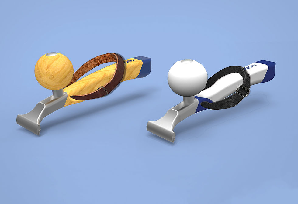
Exxentric accessory range

Decline- / Calf Raise Board